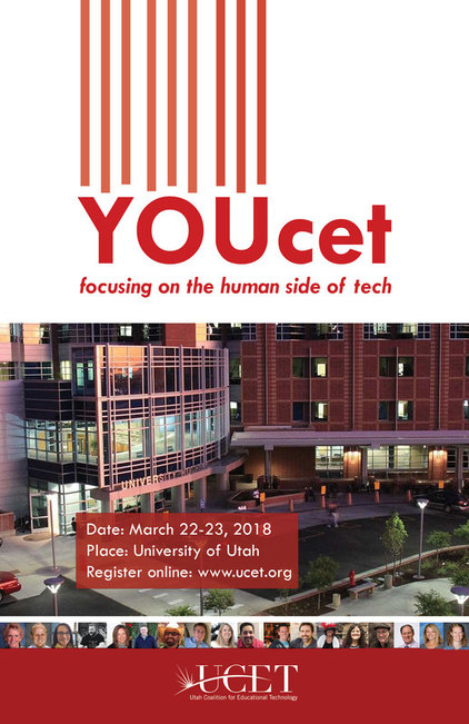
Design Thoughts: I used the color scheme and images from the UCET website to design this poster so that registrants who see the marketing for the event and who go to the website will have a cohesive visual experience. I also used opaque red boxes with white text for the even information, similar to the website. Tying in the board members' photos aligns with the theme of "you" or people being the focus of tech for this conference. Vertical lines on top draw more attention to the YOU.
Photoshop Skills Used:
Top alignment of people photos
Left, right, and center alignment of theme, event information, and UCET logo throughout