Use repetition of an image and a disruption of the repetition for emphasis.
Contrast colors and use negative space to reinforce differences in repeated elements.
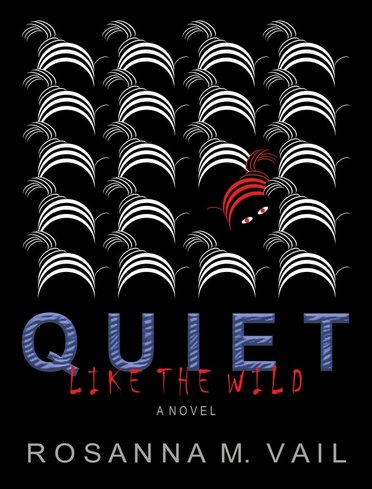
I started by creating a few arc shapes as a brainstorming activity, and it morphed into the use of multiple arcs to build a zebra image. The black background connects with the negative space of the zebras to form the black and white pattern. A red zebra breaks the repetition in color, alignment, and direction. Negative space under the red zebra is used to create the visual of a woman, thus giving a different perception of what the zebra images could also be. A zebra layer effect in the title aligns with the theme. This is a non-existent fictional book that showcases how cover design could indicate what a published work is about and entice readers to flip over to read the summary.