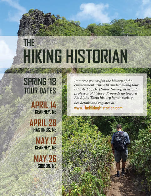
EXHIBIT 9: Flyer Design Thoughts: Although the flyer's information is fictitious, I had fun developing a possible event that my husband might be interested in. A full-bleed photo helps convey that this is an immersive experience and may stand out if placed next to white-space heavy flyers. Using opaque boxes allows the text to be readable without losing the effectiveness of the full photo.
How I created this image:
Used the eyedropper tool to pull colors from the photo for the font colors.
Aligned text and opaque boxes to create straight lines and space between elements where the photo shows through.
Utilized contrasting serif and sans-serif fonts, bold, and italics.
Overlaid opaque boxes, creating a border, to increase readability of smaller text while remaining consistent with the opacity level of the other box elements.
Thought in terms of square grid lines that could develop into various rectangular-shaped elements.